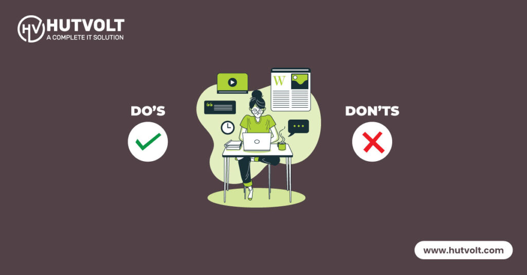
In this digital age, it’s essential to have a website that reflects your brand and meets the needs of your customer. WordPress could be the perfect CMS for your brand website which should be optimized for any kind of device. A responsive website is easier for your client to navigate and engage with your content. Today I will try to figure out some important points to having a responsive website with WordPress. So, let’s learn more about it.
What is responsive website design?
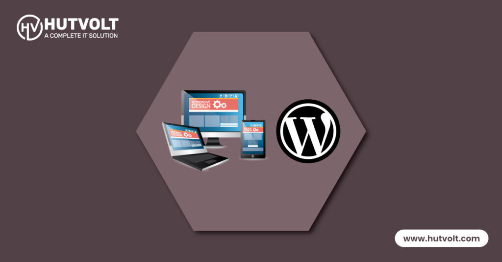
Responsive website design is a design pattern that ensures your website can be visible and accessible from any device. Whether it’s a desktop, laptop, tablet, or mobile. It will reorganize your website layout, resize and place images, and adjust texts to fit different sizes of screens. A responsive website increases your website readability and makes it easier for your client/customer to navigate your content or products.
How Responsive Website Design Works?
Responsive website design is the perfect solution for small to medium size businesses seeking an informative, user-friendly website. This type of design utilizes flexible grids and layouts that adjust to fit the screen size of the device being used to access the website, making it easy to see and navigate all content. Fluid grids are used to create the design, allowing all content to resize as needed to fit the device’s screen size.
Using Cascading Style Sheets (CSS) media queries, Responsive website design offers small- to medium-sized businesses the ability to accurately detect the screen size of the device and adjust the layout and design of the website accordingly. By applying different styles to a website’s layout and design depending on the device’s screen size, CSS media queries enable a more dynamic, tailored design unique to each user.
For small to medium size businesses, if their website is accessed on mobile devices, it will be optimized for the smaller screen size. This includes the rearrangement, resizing and optimization of fonts, images and the content itself to fit the smaller screen size, as well as faster loading times.
To ensure accessibility and usability for small to medium size businesses, responsive web design takes into account device features such as touch screens. This requires larger buttons and bigger links that are easy to tap with a finger. By tailoring the website for various devices such as desktop computers, tablets and mobile phones, this informative approach ensures all the necessary functions are available for customers no matter what device they are using.
Benefits of Responsive Website Design
Improved User Experience
Having a responsive website design is an invaluable asset for small to medium size businesses. It optimizes user experience as it allows the website’s content to be easily accessible and readable no matter what device is being used. No longer will users have to maneuver between desktop/mobile versions or zoom in and out to see the content, as the website will automatically adjust to the device being used. This makes navigation easier and faster, unveiling a hassle-free user experience.
Increased Conversion Rates
Having a responsive website design can greatly benefit small to medium size businesses by increasing conversion rates. This is because CTA (call-to-action) buttons remain easily accessible and visible, no matter what device is being used. Such a key component of all websites is imperative for businesses to convert potential leads into customers, and a responsive design is the best way to ensure this.
Improved SEO Rankings
A responsive website design can be a great benefit to small to medium size businesses – not only does it provide a streamlined and user-friendly experience, but it can also result in improved SEO rankings, as Google awards higher rankings to mobile-friendly websites. Responsive design allows websites to be accessed on any device and gives businesses a competitive advantage when it comes to visibility on search engine rankings. To hone your website and maximize its SEO rankings, considering investing in a responsive website design.
Cost Savings
Responsive website design can provide a cost-saving benefit to small to medium size businesses by avoiding the need to create different websites for different devices. A website built with a responsive design will provide users with an optimal viewing experience on any device, resulting in cost-savings for the business as separate mobile and desktop sites will not need to be created.
Why WordPress is popular for Responsive Websites?
Creating a website for your small to medium size business utilizing the WordPress platform is an effective way to build a responsive website. Not only is the renowned CMS supported by an extensive community of developers that provide customizable themes and plugins specifically designed for responsive web design, but you’ll also save time and money relative to custom web development.
Choosing WordPress provides an efficient, reliable, and cost-effective approach to creating a responsive website for your business. With a large number of available plugins, themes, and support from a vast network of developers, you can trust WordPress to provide the best for your website needs.
For small to medium businesses, WordPress comes with a responsive design built-in to its core. Default themes are automatically optimized to work on various devices, ensuring that all websites constructed on the WordPress platform are compatible with handheld, tablet, and desktop formats. This ensures a smooth, optimized, and effective browsing experience no matter the device.
Thirdly, WordPress allows businesses, particularly small to medium businesses, to easily customize and optimize their websites for responsive design. Various plugins such as WPtouch and Jetpack enable one to build a mobile-friendly version of the website, with page builders such as Elementor and Beaver Builder can be employed to construct custom themes that are responsive. All of this offers businesses an informative way to create a great browsing experience for their customers.
Primarily, businesses, especially those of a small- to medium-size, can take advantage of WordPress to customize and enhance their websites for a responsive design. Plugins such as WPtouch and Jetpack can be utilized to create a mobile-friendly version of the page while page builders like Elementor and Beaver Builder make customizing themes for a fully responsive design possible. All this is offered to small- to medium-sized businesses to allow them to provide their customers with an enjoyable and informed browsing experience.
Enhanced User Experience
A responsive website design serves a range of purposes, making it an essential asset for small to medium size businesses. This type of design makes it easier for customers to access the website from any device – whether it’s a desktop, tablet or mobile phone – and have the same user-friendly experience. This creates a consistent platform for users to interact, helping to optimize user engagement and satisfaction.
By deploying a mobile friendly, responsive website design, text, images and videos are tailored for each screen size, making it easier for customers to navigate the website with ease and find the information they need quickly. Ultimately, this enhanced user experience will drive website traffic, longer visits and greater conversion rates – all of which can benefit small to medium size businesses in achieving their website goals.
Improved Security
For small to medium size businesses, providing a secure website with a responsive design is an essential part of keeping customers engaged, establishing loyalty and increasing revenue. Additionally, by having a secure website, businesses can protect their reputation and brand image from potential data breaches and other security incidents that can cause financial and reputational damage. As such, it is important that WordPress websites, commonly used by these businesses, are designed to be secure in order to mitigate these risks.
Better Accessibility
Applying a responsive website design for WordPress websites can give small to medium size businesses a host of advantages, including improving overall accessibility. This entails integrating features like focusable elements, alt text for visuals, descriptive links, and keyboard navigation, to make sites more accessible for those with disabilities such as visual and motor impairments.
Responsive design can also make sites more user-friendly for those relying on assistive technology such as screen readers, which are vital in helping visually impaired users to access a website’s content. The outcome of this is widened reach, a boost in user engagement, and far greater inclusivity and diversity.
Ease of Use
For small to medium size businesses, responsive website design is a great benefit. With this design, navigation is easy – no matter the device. Buttons, menus, and other interactive elements are optimized for each device. Plus, user-friendly content management systems like WordPress make website content easy to manage and update, improving ease of use. Responsive design helps save time, costs, and simplifies website management and maintenance.
Summary of the importance of responsive website design for WordPress websites
In summary, responsive design is a must for modern WordPress websites. It optimizes a site for all devices and provides a quality user experience. It also adds security, accessibility and ease of use, important for success. Mobile users are increasing, so a responsive design is now essential. Small to medium businesses should not hesitate; they must use a responsive design to guarantee their WordPress site is secure, user-friendly and achieves their goals.
In conclusion, responsive website design is a critical element for modern web development for small to medium size businesses. It is essential for creating effective WordPress websites which offer a consistent, high-quality user experience, improving engagement, conversions and potential revenue.
Additionally, it enhances security, accessibility and ease of use, making it paramount for achieving website goals. With the surge in mobile device usage, responsive website design is no longer optional but vital for competitive and successful websites. Utilizing this technology guarantees that your WordPress site is user-friendly, secure and effective in its purpose.